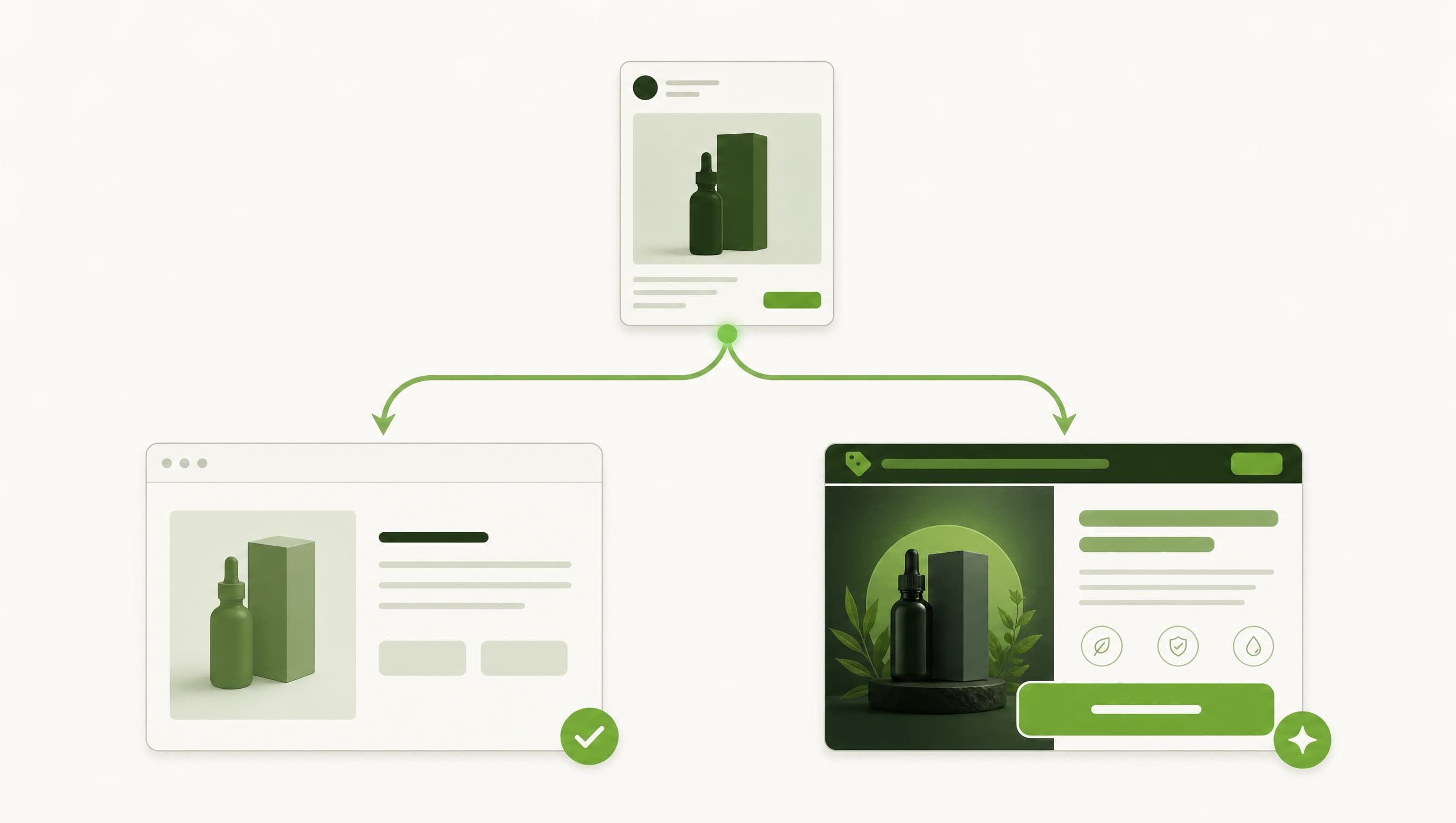
The ad is rarely where a restricted campaign dies. The page it points to is.
You can build a clean creative, get it approved, and still lose the account a week later. Why? Because the landing page is being read by two completely different audiences at the same time, and they want opposite things from it. One is a review system scanning the destination for a reason to pull the ad. The other is a real buyer who needs a reason to hand over a card. Build a page that only satisfies one of them and the campaign fails, just at a different point. Please the buyer and the reviewer bans you. Please the reviewer and the buyer bounces.
That is the real problem with landing pages in cannabis, CBD, kratom, vape and peptides. Not design. Not copy polish. The fact that one URL is being asked to do two jobs that pull in opposite directions. Get that split right and everything downstream gets easier. Get it wrong and you will keep blaming your creative for a problem that was never in the ad.
The page is doing two jobs at once
Every restricted campaign asks its destination to serve two audiences who will never agree:



 Live general ad creatives from real Icarus client campaigns.
- **The review system** crawls the destination URL before the ad goes live and keeps checking after. It is hunting for restricted products, restricted words and health claims. Find any, and the ad is rejected or the account is banned.
- **The real buyer** clicks through wanting the product, the offer and a reason to trust you. Give them a sanitised, claim-free page and they leave. They came for the exact thing you are not allowed to say out loud in the ad.
Live general ad creatives from real Icarus client campaigns.
- **The review system** crawls the destination URL before the ad goes live and keeps checking after. It is hunting for restricted products, restricted words and health claims. Find any, and the ad is rejected or the account is banned.
- **The real buyer** clicks through wanting the product, the offer and a reason to trust you. Give them a sanitised, claim-free page and they leave. They came for the exact thing you are not allowed to say out loud in the ad.
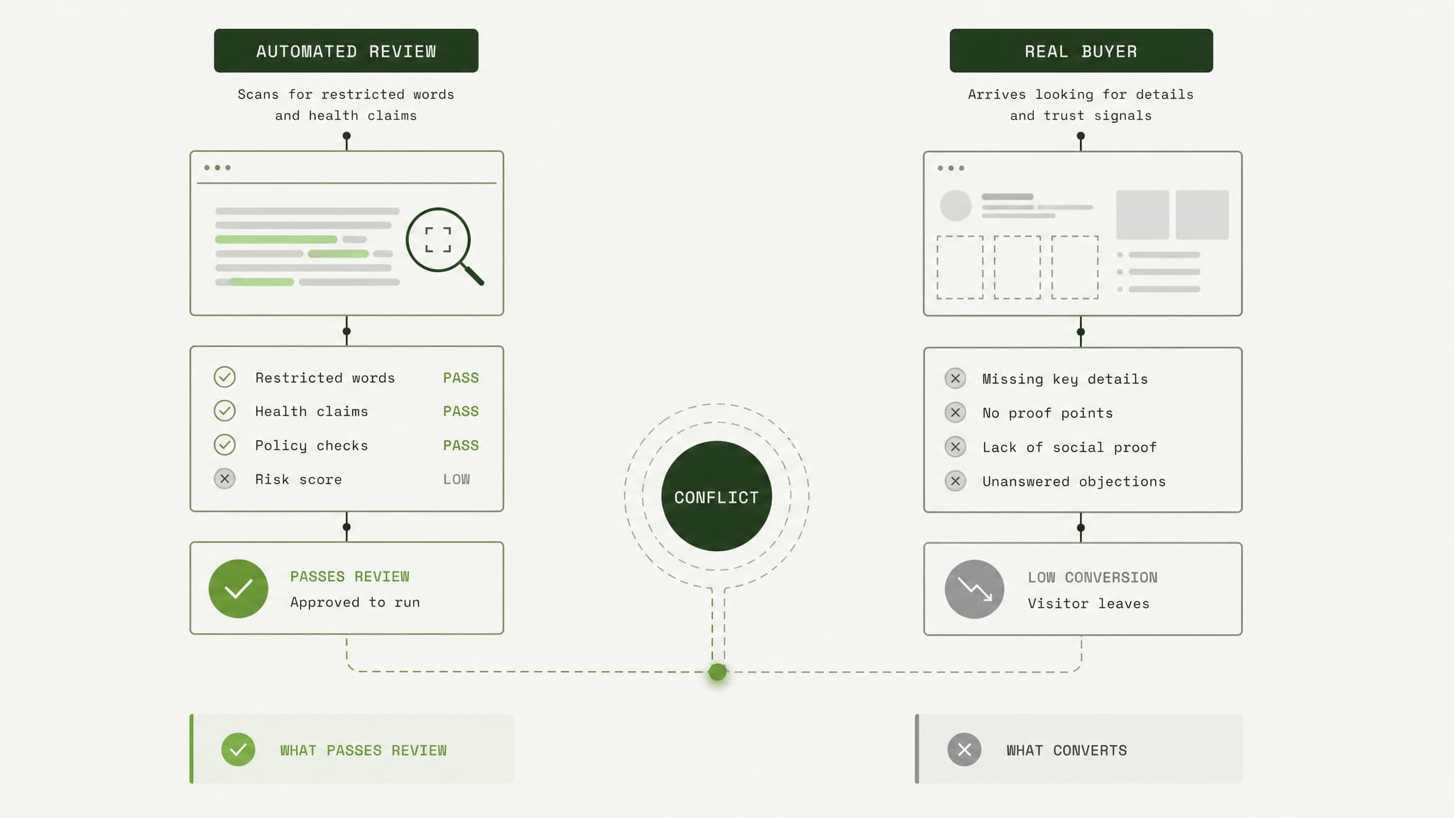
A review system and a buyer want opposite things from the same landing page.
Here is the trap most people fall into. They try to build one page that threads the needle: restricted enough to convert, clean enough to pass. It never holds. You end up with a page too tame to sell and still risky enough to flag. The move is not to compromise between the two. It is to stop asking one page to be both.
What actually trips the review on a page
Before you build a page that passes, you have to know what the crawler reacts to. After a decade in these verticals, the flags are consistent:
- Restricted product language: the substance names themselves. Cannabis, THC, CBD, kratom, the chemical names, vape terms. The crawler reads text, and these are the fastest trigger there is.
- Health and outcome claims: anything therapeutic. "Feel younger", "healthy joints", pain, anxiety, relief. On a peptide page, direct human-use language is its own violation stacked on top of the product.
- Missing disclaimers: for hemp, no Farm Bill or under-0.3-percent text. For research peptides, no research-use language. The absence is a flag by itself.
- Domain history: if the destination domain already carries policy strikes, every page on it inherits the risk. A clean page on a dirty domain still starts in the hole.
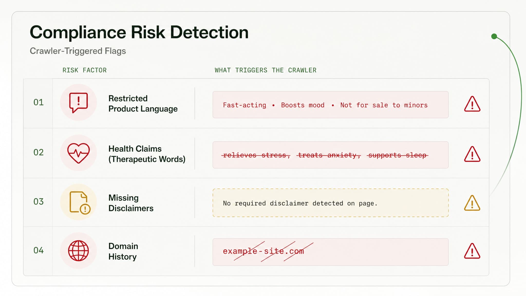
Four compliance flags that trigger ad review: restricted language, health claims, missing disclaimers, and domain history.
The worst outcome is not a rejected ad. It is the "circumventing systems" ban, where the platform decides you were deliberately hiding something. There is no clean misclassification appeal once you are there. That is the line your page structure is built to stay behind. Meta's written policies read one way and enforce another, and the destination is where that gap bites hardest.
Two pages, not one
So the answer is not a cleverer single page. It is two.
The destination in your ad's URL field is built to be seen by review: a clean, compliant page carrying no restricted products, no restricted claims and no active offer. It lives on its own separate offer domain, not bolted onto your main brand site, and it does not link out to the money page. That separation is the whole point. One weak link from the compliant page back to the real store can drag domain-level trouble onto everything you own.
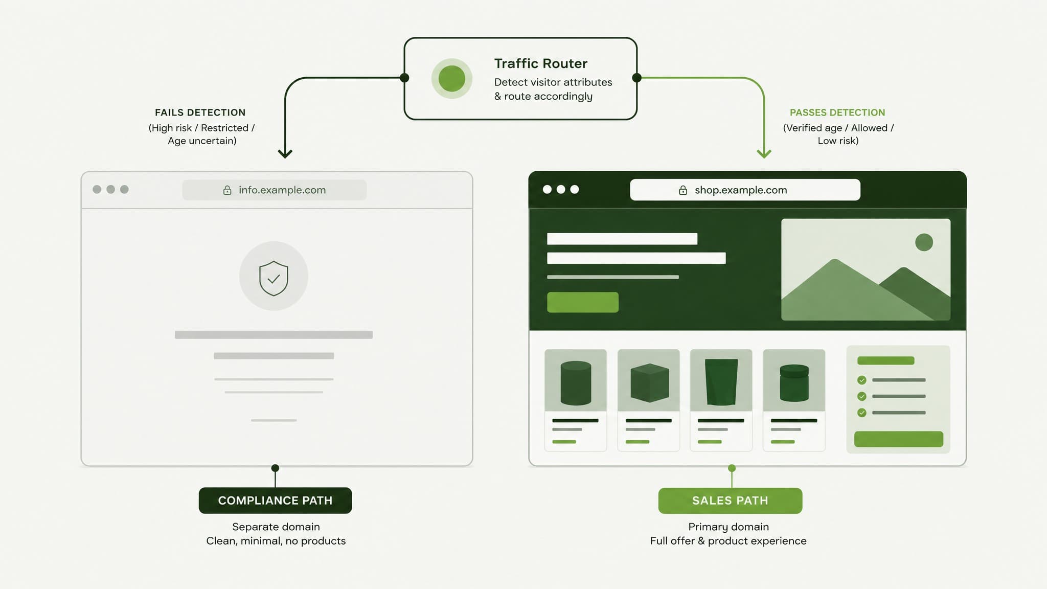
Two separate landing pages route visitors based on detection: compliance page for review, sales page for real customers.
The page your real customers see is the one that actually sells: the offer, the products, the discount, the full copy. Same entry point, different destination depending on who is asking. The mechanics that route each visitor to the page meant for them are, honestly, table stakes at this point. Think of it as stable plumbing running quietly under the business. The question that matters to you is what each page has to accomplish, not the wiring.
Two things about this setup people underestimate:
- A small slice of real humans will hit the compliant page by accident. Visitors on a VPN, an odd connection, or bouncing between several ads can get read as suspicious and routed to the safe side. It is a low single-digit percentage, but it is not zero, which is why some operators quietly turn that page into an email capture instead of wasting the visit.
- This system rots if nobody watches it. Offers change. A page gets swapped. A setup silently expires and suddenly every click is landing on the compliant page and spending money on nothing. It is easy to stand up once and easy to forget, and forgetting it is where the real fires start.
That maintenance load is exactly why brands hand this to an agency instead of duct-taping it themselves. Standing it up is a weekend. Keeping it alive across dozens of offers and campaigns without a single click leaking is ten years of feel.
The compliant page still has to look like the ad
A compliant page that is clean but irrelevant is its own failure, and Google is strict about it. If the page a bot sees has nothing to do with the ad that sent traffic there, the platform flags the destination as misleading and your quality score falls through the floor.
Clean is necessary. Relevant is also necessary. You need both.
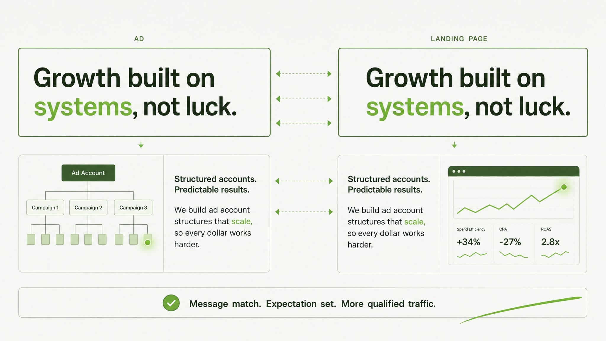
Ad copy and landing page headline aligned to tell one coherent story to compliance reviewers.
The fix is boring and it works: write the ad copy to match the compliant page, not the offer the buyer eventually sees. The ad and its stated destination tell one coherent story to the reviewer. The offer lives past the click, where the buyer is. Break that alignment and you trade a product rejection for a relevance rejection. Same dead campaign, different cause.
The buyer page is where you actually win
Passing review keeps you alive. It does not make you money. The page your buyer lands on has to do the selling, and in restricted verticals the structure that converts is not a mystery. It is the same direct-to-consumer skeleton, built tight:
- Offer bar at the very top, above the hero. Free shipping, the discount, the guarantee, before anything else loads.
- Discount already applied. Bake the code into the link so the visitor arrives and the price is already lower. No box to hunt for, no code to remember, no friction.
- Social proof early. Reviews and customer counts near the top, not buried at the bottom of the page.
- Mechanism, then objections, then risk reversal. Why it works, the pushback handled in the middle, a money-back guarantee and third-party testing to close the gap.
- One call to action. Strip the nav. Every extra link is a door out of the sale.
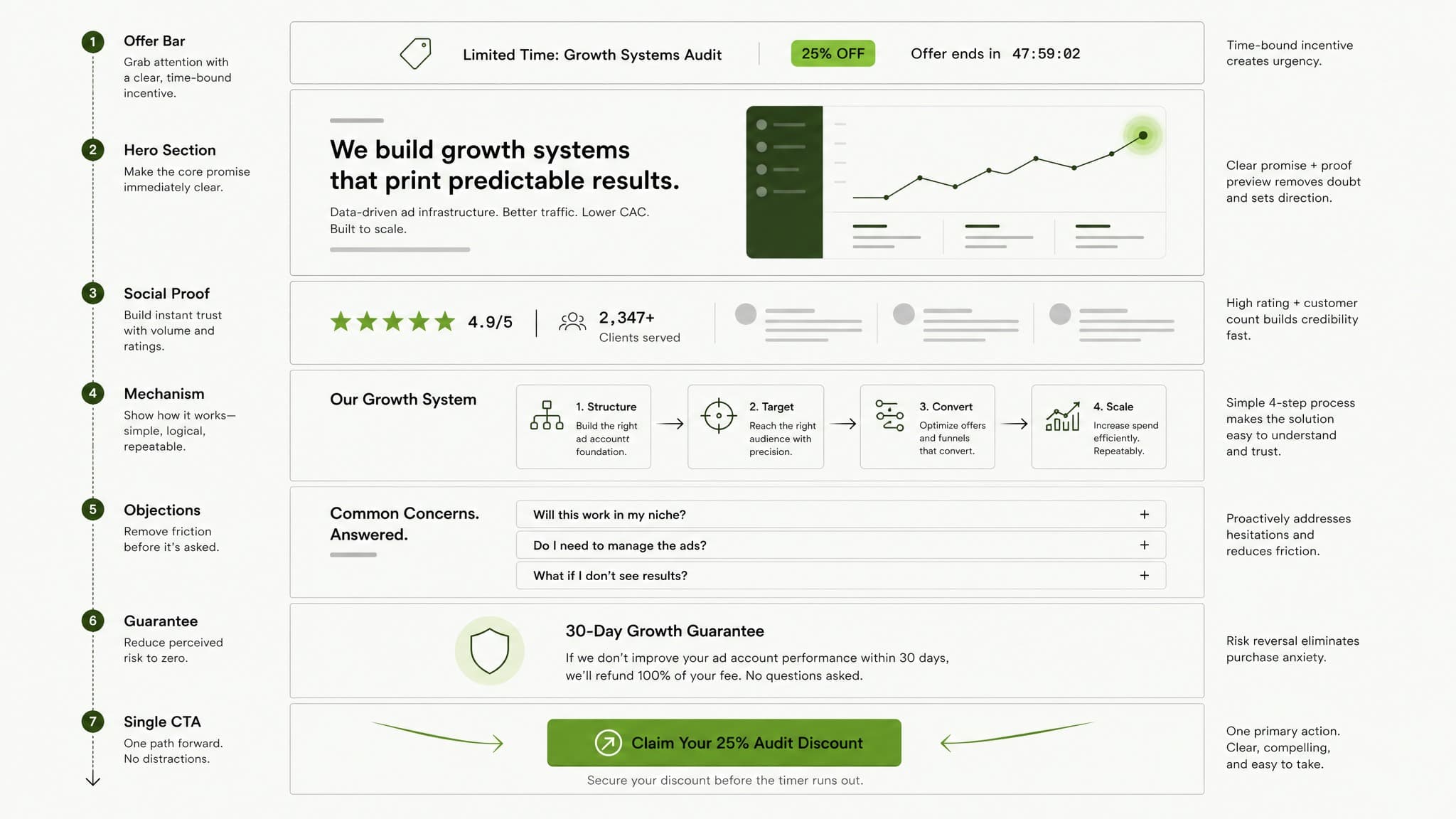
A landing page structured to move buyers from offer through objections to a single checkout button.
Give a page like this to a cold audience with everything working and you can watch the difference in the numbers directly. We have run the same offer at the same spend across two brands where the only real variable was the quality of the page, and the better page won outright. The page is part of the ad. It always has been.
The offer is the biggest lever on the page
If I could fix only one thing on a struggling restricted-vertical page, it would be the offer and how visible it is. Not the headline. Not the hero image. The offer.
Shipping fees are Kryptonite to a paid campaign. A cold visitor who has not committed yet hits a shipping threshold, has to do mental math, and that pause is where you lose them. On cold traffic the default should be unconditional free shipping wherever the margin allows it. When a brand switched a struggling campaign to a bigger first-order discount plus unconditional free shipping, that was what turned it around, not a new creative.
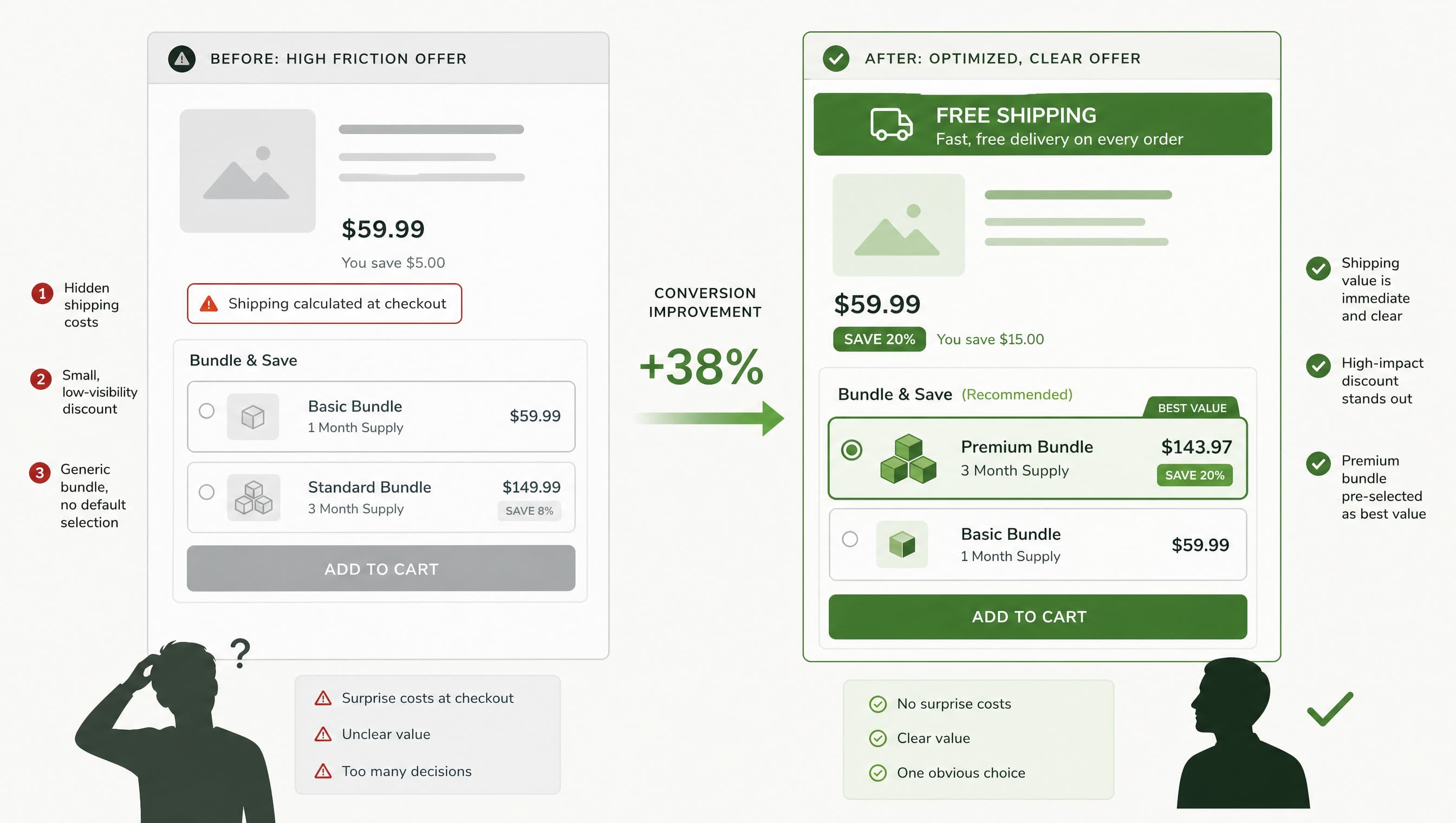
Left: scattered offer details with shipping surprise. Right: prominent free shipping, clear discount, pre-selected bundle.
Two more that cost nothing:
- Pre-select the best bundle. Default the highest-value option and most people leave it there. That is an average-order-value lift with zero design work.
- Match the offer end to end. If the prelander promises 30 percent off and free shipping, the product page has to show exactly that. A mismatch and the buyer feels the switch and bounces.
One caution on how you read all this. A first-order return that only breaks even is not a failing page if the product gets repurchased. Front-end ROAS is just the price you paid to acquire a customer, not a verdict on the business. For anything with reorders, the numbers that matter are cost per acquisition against lifetime value, and a page that breaks even on the first order and prints on the second is a winner. If you are staring at a front-end number trying to decide whether the page works, run it through the real math first.
Match the page to the traffic, not the other way round
Pointing every ad at one page is a mistake. Cold, warm and hot traffic need different information, and the format follows the temperature:
- Advertorial or prelander for cold traffic. An editorial-style article that leads with the problem and earns trust before it asks for anything. Strip the brand nav and footer so it reads like a piece of writing, not a store. For most cold restricted traffic the winning shape is a two-step funnel: advertorial first, offer page second.
- Listicle or buyer guide for cold-to-warm traffic that responds to "here are the best options in the category". The reader is nodding along before they ever see a price.
- Sales page for warm traffic, or for anyone the prelander has already warmed up. This is where the full offer structure above lives.
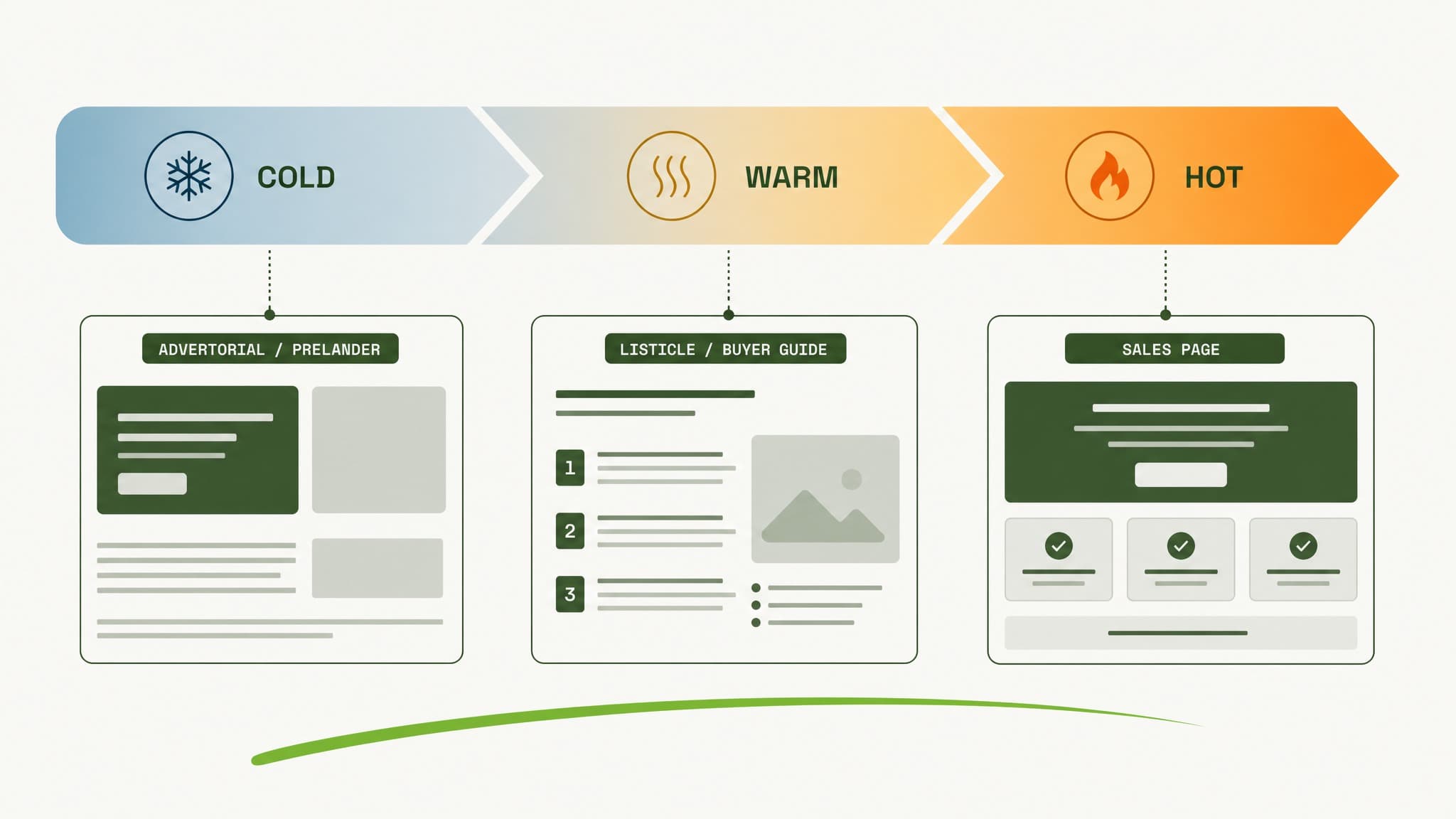
Cold traffic flows through advertorial, warm traffic through listicle, hot traffic to sales page.
The point is not to own all three for their own sake. It is to stop pointing a cold audience at a hard sales page and then wondering why they bounce. Different verticals start from different levels of trust, and the format has to meet them there.
When the page looks right but nothing sells
Here is the diagnostic mistake that wastes the most money: the page looks fine, sales are flat, so the team rebuilds the page. Often the page was never the problem.
Trace the drop-off before you touch anything:
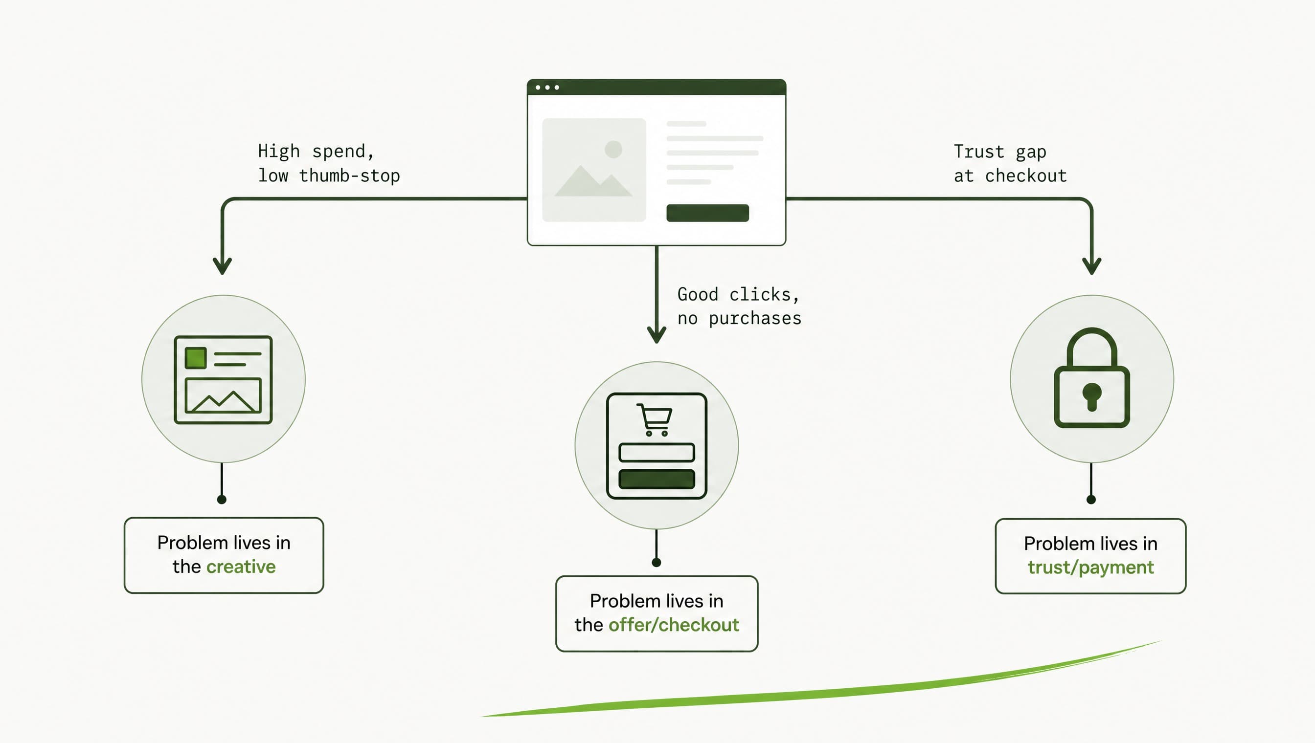
Three diagnostic paths reveal where sales actually break: in ad creative, checkout flow, or payment processing, not the page.
- High spend, low thumb-stop rate: that is a creative problem, not a page problem. Traffic never engaged in the first place.
- Good clicks and add-to-carts but no purchases: that is an offer or a checkout problem. The page did its job and something after it broke.
The most common silent killer sits past the page entirely. A trust gap at checkout. A payment processor quietly failing. A login wall or an age gate that fires twice because your ad traffic was never whitelisted to skip it, so the customer verifies once on the page and again at checkout and gives up. None of that gets fixed by redesigning the landing page. Campaign and account health is the same discipline: rule out the plumbing before you blame the paint.
Getting it built right
A compliant landing page in a restricted vertical is really two problems wearing one coat: pass review while staying relevant to the ad, and convert without watering down the offer. Solve them separately, on separate pages, and keep the whole thing maintained as offers and campaigns change. That last part is where most do-it-yourself setups quietly bleed out.
This is the work we have done across cannabis, CBD, kratom, vape and peptides since 2016, for around 300 brands. If your ads keep getting approved but the destination is where things fall apart, see how we handle it for your vertical or start a conversation.